Files
der-1.gif
der-2.gif
dt-1.gif
dt-2.gif
dt-20.gif
dt-3.gif
dt-4.gif
fig-1.gif
index.html
lim-1.gif
MatlabPlotting.mp4
MatlabPlottingR2018a.mp4
newtons-method.gif
next_motif.gif
plt-8.gif
plts-1.gif
plts-2.gif
plts-3.gif
plts-4.gif
plts-5.gif
plts-6.gif
plts-7.gif
plts-7a.gif
previous_motif.gif
projectile-motion.mp4
projectile-motionR2018a.mp4
salary.mp4
salaryR2019a.mp4
shrt-1.gif
sin365.mp4
sin365R2018a.mp4
test.gif
tutorial-pieces.html
tutorial.html
tutorial001.gif
tutorial001.html
tutorial002.gif
tutorial002.html
tutorial003.gif
tutorial003.html
tutorial004.gif
tutorial004.html
tutorial005.gif
tutorial005.html
tutorial006.gif
tutorial006.html
tutorial007.gif
tutorial007.html
tutorial008.gif
tutorial008.html
tutorial009.gif
tutorial009.html
tutorial010.gif
tutorial010.html
tutorial011.gif
tutorial011.html
tutorial012.gif
tutorial012.html
tutorial013.gif
tutorial013.html
tutorial014.gif
tutorial014.html
tutorial015.gif
tutorial015.html
tutorial016.gif
tutorial017.gif
tutorial018.gif
tutorial019.gif
tutorial020.gif
tutorial021.gif
tutorial022.gif
zer-1.gif
zer-1a.gif
zer-2.gif
zer-3.gif


6 Plotting functions
One of the most exciting uses of MATLAB is its ability to easily create the graph of a function. Suppose that we wish to plot the graph of the parabola y=x2 over the interval -2 Ł x Ł 2. How might we do this?If you wanted to plot this on a piece of paper, you might generate a table of numbers such as
| x | -2 | -1 | 0 | 1 | 2 |
| y | 4 | 1 | 0 | 1 | 4 |
Then you would plot each point (x,y) and connect the values with a curve which seemed appropriate -- in this case a parabola. Let's call this way of plotting ``x vs. y''.
Another way you might want to plot is to simply tell the computer to plot the function ``x2''. The command to plot a symbolic function will be ezplot .
MATLAB knows of other types of plots as well:
- Parametric plots: these allow you to plot x versus y only,
these are
parameterized by a third variable say t for time. Here's an example of
plotting the circle:
x(t) = cos(t), y(t)=sin(t); -2 Ł t Ł 2.
>> t =linspace(0,2*pi); >> x = cos(t);y=sin(t); >> plot(x,y); % notice we define x and y interms of % t, but we plot x vs y - Polar plots: to plot in polar coordinates
- Three-dimensional plots: plotting x, y and z.
- makemenus : Adds nice menus to plotting window which allow you to add text to graphs easily, to rotate axes, and other things. You can read about it in this file makemenu.README. The files are available on the MATHWORKS website, or on the math department site. At the math department site the windows files are in makemenu.exe and the UNIX files are here makemenu.tar.
6.1 Plotting x versus y
We see here how to plot functions, by plotting a table of values for x and y=f(x).Example: Cost of a used car
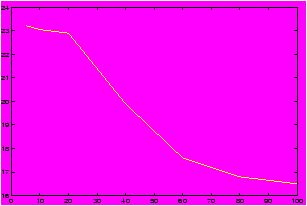
Suppose you were interested in buying a used car. You may want to know the relationship between number of miles the car has and the value of the car. Such numbers are available on the internet, for example these numbers were found at http://www.kbb.com. The price of a used 1996 Jeep Cherokee is figured according to the number of miles given. Here is some sample data:
| Mileage | Estimated Price |
| 5,000 | 23,225 |
| 10,000 | 23,050 |
| 20,000 | 22,900 |
| 40,000 | 19,900 |
| 60,000 | 17,600 |
| 80,000 | 16,800 |
| 100,000 | 16,500 |
>> mileage = [5,10,20,40,60,80,100]; % skip the thousands
>> cost = [23.225, 23.050, 22.9, 19.9, 17.6, 16.8, 16.5]; % in thousands
>> plot(mileage,cost)
From the graph we can see an interesting relationship not obvious from the table. For low, low mileage cars the graph is kind of flat prsumably as people believe the car is practically new, but as the mileage increases the cost decrease rapidly after a certain point. This may be explained by the realization that people shouldn't have to pay for the mileage already on the car, and the loss of warranty. The graph is more or less linear here. This eventually tails off as the mileage gets real high and the graph flattens out.
It is precisely the ability of plots or graphs to convey information quickly and clearly that makes them so invaluable. In this section you can learn how to create them.
6.1.1 Plotting lines
We all know that two points determine a line. What does this mean?We'll use MATLAB to plot the graph of a line using just two points.
First you may want to recall some basic formulas to describe lines:
Concept: Equations for lines
- The slope of a line:
Let (x1,y2), and
(x2,y2) be two points on a line. Then the slope of the line is
given by the rise over the run.
m = (y2-y1)/(x2-x1).
- Point-slope equation:
Let (x1,y1) be a
point on the line and m be its slope. Then the equation of the
line is
y = m (x - x1) + y1(Essentially you solve for y)
- Slope-intercept form:
Let m be the
slope and b be the y-intercept of a line (so (0,b) is a point
on the line) then
y = mx+b
- two points:
Let (x2,y2), and
(x1,y1) be two points on a line. Then
y = y2-y1 x2-x1 (x - x1) + y1
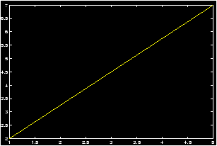
Example: For definiteness, we want to plot the line connecting (1,2) to (5,7). First lets define the points. How should we do this? Lets pair off the x values and the y values:
>> x=[1,5];y=[2,7];Now we can use MATLAB to reference the individual components if we need to. Notice how this is done:
>> x(1)
ans = 1
>> y(2)
ans = 7
So we could compute the slope by
m = ( y(2) - y(1) )/ ( x(2) - x(1) )Or we could plot the line by
>> plot(x,y)
Notice this draws a line between our two points. What if we wanted to plot the line over a specified interval, say [0,5]. We have a slope, and a range of x values, and a point (1,2). Using the point-slope form we know we should use the formula y = m (x - x1) + y1. We know m and x1 and y1, what do we do with x and y?
When plotting, we need to make a table of values for x and a corresponding table of values for y. In MATLAB this is done by letting x be a list or vector or numbers and then creating y based on x. To do this we can use the linspace command:
>> x = linspace(0,5);           % 100 evenly-space numbers between 0
                                % and 5
>> y = m * (x - x(1)) + y(1);   % point-slope form
>> plot(x,y);
Example: plot of farenheit
Let's plot the relationship between farenheit and celsius. Recall the formula is F = 9/5 C + 32. The interesting range of values might be for celsius between 0 and 100.
>> celsius = linspace(0,100);      % the domain
>> farenheit = 9/5 * celsius + 32  % our formula
>> plot(celsius,farenheit)         % the plot
>> hold on;
>> plot(farenheit,celsius)         % the inverse bunction
6.1.2 Plotting functions
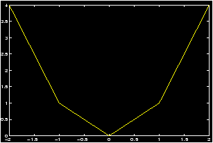
Suppose that we wish to plot the graph of the parabola y=x2 over the interval -2 Ł x Ł 2. In the absence of MATLAB, we could choose a set of x values, say, x=-2,-1,0,1,2, then square each x value to determine the corresponding y values, y=4,1,0,1,4. We then mark each corresponding (x,y) pair as a point on a Cartesian coordinate system. These pairs are {(-2,4),(-1,1),(0,0),(1,1),(2,4)}. Finally, we try to connect these points smoothly to obtain a sketch of the parabola. To create a graph of y=x2 using only the same 5 points as described above, we can issue the following MATLAB commands.>> x=-2:1:2; % creates the array x=[-2 -1 0 1 2] >> y=x.^2; % creates the array y=[ 4 1 0 1 4]; note the ``dot" after x >> plot(x,y)
A brief explanation is in order. The first line defines x to be the list (or row vector ) of values starting with -2, continuing in steps of 1, and ending at 2. (This uses the colon operator .) The second line defines y as the array of values which are the squares of the x values. That is, the y list is obtained by squaring the x list element-by-element. See a description here of the dot operator ).
What you see should be a crude graph of the function y=x2 consisting of a sequence of broken lines connecting the (x,y) points calculated. To create the graph, MATLAB simply starts with the first point, connects it with a straight line to the second point, and connects the second point with a straight line to the third point, and so on. Thus every graph in MATLAB consists of a sequence of straight lines.
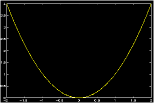
If you wish to obtain a smoother graph, all you have to do is use more points. But this requires no more labor on your part than using just 5 points. The following commands should create a much smoother graph as they utilize 201 points to construct the graph. Although it may no longer be evident, the graph still consists of a sequence of straight lines!
>> x=-2:0.01:2;     % creates the array x=[-2 -1.9900 -1.9800 ... 1.9900 2]
>> y=x.^2;          % creates the array y=[ 4  3.9601  3.9201 ... 3.9601 4]
>> plot(x,y)
Graphing functions -- more details
Here are a number of different examples of how we can use MATLAB to plot functions.
- Continuous Functions
A function f(x) is a set of ordered pairs (x,y) such that y=f(x). To create a graph of this function we first form two lists x=[x1,x2,...,xn], and y=[y1,y2,...,yn] where yi=f(xi), i=1,2,···,n and then issue the MATLAB command plot .
Example: Plot of y=ex
As an example, let us create a graph of the function y=ex describing each step in detail.
First decide the domain of the function and the desired frequency of plot points. Suppose that we let x vary from -1 to +1 in steps of 0.2. This is accomplished by the command:>> x = -1 : 0.2 : 1; % or use linspace(-1,1,11)
This creates an array with 11 elements starting at x = -1, increasing steps of .2 and ending at x = 1. If you do not type the `;' at the end of the command line you can see the array created asx = [-1, -.8, -.6, -.4, -.2, 0, .2, .4, .6, .8, 1]
Recall (Generating lists of data) for the explanation of the colon operator . (thatx=a:h:bgenerates an array of values starting at x=a, increasing in steps of `h' without exceeding x=b. Thus, this command will divide the interval [a, b] into n equal parts (n = (b - a)/h), thus sampling the domain at (n + 1) points including the two end points.
- For each value of x, calculate the corresponding value of
y. This is accomplished by the command:
>> y = exp(x);
Note that the built-in function exp(x) is defined such that if the argument x is an array, then it generates an array y of function values corresponding to each of the x values. Thus, y is now an array of 11 elements. If the semicolon at the end of the line is omitted you will see this array as:y = [.3679, .4493, .5488, .8187, 1.0000, 1.2214, 1.4918, 1.8221, 2.2255, 2.7183] - To obtain a continuous plot of ex over the domain
[-1,1], issue the command
>> plot(x,y)
The desired continuous graph will be created on the screen. Here, continuous plot means that MATLAB marks each ordered pair (xi,yi), i=0,1,2,...,n on the graph and then connects, by a straight line, the point (x0,y0) to (x1,y1), the point (x1,y1) to (x2,y2), and so on until the point (xn,yn) is reached. This graph created with 11 sample points is obviously not so smooth. Thus to obtain a smooth looking curve one needs to take sufficiently many x points depending on how rapidly the function varies over its domain. The following three commands may be used to obtain a smoother graph;>> x = -1 : 0.01 : 1 ; y = exp(x) ; plot(x,y),grid
We have added a grid command at the end to produce a set of grid lines on the graph. Note that we have used a smaller step size of 0.01 giving us 201 (2/.01 = 200) sampled points and therefore a much smoother graph.
-
Discrete plots
At times, instead of a continuous plot we may wish to obtain a discrete plot or point plot whereby the points are marked on the graph but they are not connected to each other by straight lines. In that case we need to specify the symbol we wish to use to mark each point. Supposing that the symbol is`*', the plot command becomes>> plot(x,y,`*')
Try this and see what happens.
MATLAB permits only a limited number of symbols to be used in discrete plot s. These are the symbols *, `.', `+',`x',`o'.
Example: Discrete Plots
To see the discrete points distinctly, you should use a reduced number of sample points, by taking a larger step size:>> x=-1:0.2:1; y=exp(x); plot(x,y,`*'), grid
which will produce a discrete graph with exactly 11 points.
A convenient way to control the number of points on a graph without calculating the corresponding step size over the domain of definition is to use the built-in function linspace . Using this function, the above graph can be obtained by entering>> x=linspace(-1,1,11); y=exp(x); plot(x,y,`*'), grid
More generally, the commandx=linspace(a,b,n);generates n points equally spaced over the closed interval [a,b]. Note that if you wish to divide an interval into 10 equal subintervals, you need 11 points including the end points of the interval. If you omitnthen the commandlinspace(a,b)generates 100 equally spaced points over [a,b].
- GRAPHING MORE THAN ONE FUNCTION ON THE SAME GRAPH
You can plot more than one function at a time by using the plot command in a extended way.
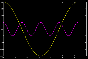
Example: Amplitude vs. Period
Let's investigate the relationship between the amplitude and the period for the cosine function. Recall
Concept: the generic form of a cosine function
y = a + d cos(b x + c).- The value of a determines the shift up or down the y-axis
- The value of |d| is the amplitude.
- The value of b determines the period by the formula T = 2p/b.
- The value of c determines the phase shift. (it is not c, but rather c/b.
>> x=0:pi/100:2*pi; y1=4*cos(x); y2=cos(4*x); plot(x,y1,x,y2), grid
By giving MATLAB data in this form it knows to graph both functions. Note that MATLAB decides a frame which fits in all function values, and then creates a plot of each function. If you have a color monitor, different colors will be used for each function.
Another way to achieve this is with the hold function:>> x=0:pi/100:2*pi; y1=4*cos(x); y2=cos(4*x); >> hold on; % prevents second graph >> plot(x,y1), grid % from over-writing the >> plot(x,y2) % first
The hold command has two uses hold on or hold off. This toggles whether or not MATLAB will try to draw the next graph without erasing the previous one.
Example: Secant line example
Concept: Definition of the secant line
The secant line is the beginning of the study of derivatives in calculus. It involves lines, and their slopes. The fundamental thing to know is the following definition:
The limit of the slope of the secant line (if it exists) is the derivative of the function.
Let y=f(x) be a function and let x1,x2 be two points in its domain and consider the secant line connecting the two points P1=(x1,f(x1)) and P2=(x2,f(x2)) on the graph of this function. The slope of this secant line is given bym=(f(x2)-f(x1))/(x2-x1).
This represents the average slope of the function f(x) on the interval [x1, x2].
Another way we see this written is to let h = x2 - x1 be the difference between the two points x2 and x1. Then the formula for the slope becomes
m=(f(x1+h)-f(x1))/h,
and the derivative of f(x) at the point x1 is given byf'(x1) = lim h® 0 (f(x1+h)-f(x1))/h.
To see the secant line and the function on the same graph, we need to plot both functions simultaneously. This is done via the hold command: Let f(x) = sin(x), and let x1 = p/4, and x2 = x1 + h where h = p/8. We'll plot the secant line and the function between 0 and p/2.>> x1=pi/4;h=pi/8;x=linspace(0,pi/2); % assign the constants >> m = (sin(x1+h) - sin(x1))/h; % find the slope >> ysin = sin(x); % the y values for f(x) >> yline = m*(x-x1) + sin(x1) % point-slope form of a line >> hold on; % turn on hold >> plot(x,ysin) % plots the function >> plot(x,xline) % plots the line
You should see both plots on the graph.
- GRAPHING FUNCTIONS OVER DOMAINS WITH DELETED POINT(S)
When we do not have a continuous function then we have to do more work to plot it with MATLAB.
Example: Deleted points in the domain
Plot f(x) =1/(x2-1) over [0,2]: Notice the function f(x) is a discontinuous function at x=1. First try typing:>> x = 0 : 0.05 : 2; y = (1)./(x.^2-1);^ plot(x,y), grid
What does the graph look like?
The function is undefined at x = 1. In processing you can avoid that point by dividing the domain into two parts. Notice we avoid the point x=1.>> x1 = 0 : 0.05 : 0.95; y1 = (1)./(x1.^2-1); >> x2 = 1.05 : 0.05 : 2; y2 = (1)./(x2.^2-1); >> plot(x1,y1,x2,y2),grid
Mathematically, we plotted the following function:f(x) = (x2 -1)-1 if x ą 0, f(0)=0.f(x) = ě
í
î1/(x2-1) 0 Ł x < 1 1/(x2-1) 1 < x Ł 2
- PLOTTING FUNCTIONS DEFINED BY MORE THAN ONE EQUATION
Many functions in Mathematics need to be defined in a piece-by-piece fashion. For example the absolute value function, or the greatest-integer function. To plot these we have to use MATLAB in a piece by piece fashion as well
Example: The sign function
Plot the following function, sometimes called the, sign function, over the interval [-3,3] defined as followsf(x) = ě
í
î|x| / x if x ą 0, 0 if x = 0
f(x) = |x|/x if x ą 0, f(0) = 0.
Define>> x1=linspace(-3,0); y1=abs(x1)./x1; % -3<x<0 >> x2=linspace(0,3); y2=abs(x2)./x2; % 0<x<-3 >> plot(x1,y1,0,0,'*',x2,y2), grid
Note that in the plot command, the single point at the origin is being marked with a `*' to make it visible. This one is not well suited for the hold command.
6.2 plotting with ezplot
6.3 Parametric plots
6.4 Polar plots
6.5 Three-dimensional plots
MATLAB has some abilities to work with 3-dimensional plots. In this section you can learn how to plot- a vector as a line segment.
- a plane in 3 dimensions.
- a cylinder , which mathematically speaking is more complex than your last can of Coke.
- surfaces of revolution .
- a vector-valued function as a parameterized curve.
- Functions of the form z = f(x,y).
You may find the makemenus m-files to be of use with manipulating the graphing window. Among other things, these allow you to use the mouse to rotate the viewing angle.
6.5.1 Three-dimensional plotting functions
To plot with three dimensions we use the following built-in MATLAB functions: meshgrid , plot3 , surf , view , sphere , cylinder .As well, we will define several short m-files that facilitate the plotting process. These use the MATLAB commands above to plot.
6.5.2 Plotting vectors
Plotting vectors is as easy as connecting two points with a line. Recall in two dimensions, to connect two points we use the plot command. An example is given here>> plot([1,5],[2,7]);This plots the line between the points (1,2) and (5,7). In other words, the command plot(x,y) plots the list of numbers in x versus those in y connecting the points (xi,yi) to the points (xi+1,yi+1). The plot3 command does exactly the same thing, only it needs three coordinates for a point as it plots three-dimensional points. So to connect the point (1,2,3) to the point (5,7,8) we could use the command
>> plot3([1,5],[2,7],[3,8]); % connects the two points with a lineNotice, you may have your points given in terms of a vector, say v=á 1,2,3 ń to plot these you can access the individual components as follows
>> v = [1,2,3]; plot3(v(1),v(2),v(3)); % plots the point associated to
                                       % the vector v
The simple
m-files
qvector.m will allow you to plot
a vector with the command qvector(v)6.5.3 Plotting planes
To plot a line in two dimensions you make values of x and corresponding values of y and plot the pair of lists. For example this will plot a line>> m = 5; b = 2; % y = mx + b >> x = linspace(-5,10); % plot the line between -5 and 10 >> y = m*x+b;plot(x,y); % make the plotWe need to do exactly the same thing to plot a plane in MATLAB. So we need to generalize the linspace command and go from there.
Concept: equation of a plane
Recall the equation of a plane which is normal to the vector v, and goes through the point P=(x0,y0,z0) is given by
n · á x - x0, y - y0 , z - z0 ń = 0
or solving, if n = á a,b,cń then one has
a x + by + cz = d = n · (P) = ax0 + by0 + c z0.
if c is not 0 then we can solve to get z = (d - ax - by)/c.
So to plot a plane we first generate a mesh of values for x and y, then we find z and then we plot using the surf command. Here is an example
>> n = [1,2,3];p=[3,2,1];       % normal to n, through p
>> [x,y] = meshgrid(-1:.1:1, -2,.1:1); % meshgrid like linspace.
>> z = (dot(n,p) - n(1) * x - n(2) * y)/n(3); % n(3) non zero
>> surf(x,y,z);                 % plots the surface
The m-files qplane.m will automate this for you, and plot the vector as well.
An important command for viewing planes is the view command. This allows you to change perspective.
>> view(n);                     % called with a vector. What is the
                                % output?
>> view([-3,0,1]);              % a vector parallel to plane. Where did
                                % the plane go?
>> view([1,1,1])                % view from the point (1,1,1)
6.5.4 Plotting Cylinders
Concept: Plotting Cylinders
In Calculus, a cylinder is defined to be all the points which lie on lines that are parallel to a given vector, and go through a given curve. For example, the usual cylinder we think of is made up of all points on the lines parallel to the z-axis, or the vector k, that go through the curve given by x2+y2=1.
To plot a cylinder then we could simply shift the curve in the direction of our vector and then trace out the curve, repeating this several times. Here is an example
>> t = (0:25)*pi/25;            % or linspace(0,pi,25)
>> x = t; y = sin(t);           % parameterize the sine curve
>> z = zeros(size(x));          % make z a list of 0's, the same size
                                % as x
>> v=[-1,-2,3];                   % our vector
>> plot3(x,y,z);
>> hold on;
>> for k=(0:10)/10              % loop between 0 and 1 10 times
plot3(x + k*v(1),y + k*v(2),z + k*v(3)); % plot the curve shifted
end
This is automated by the
m-files
qcylindr.m
(notice the silly spelling). (This is different than the built in
MATLAB command
cylinder
which plots a surface of revolution
despite its name.)To use the qcylinder command, we need to trace out a parameterized curve in the x,y-plane, and pick a vector. Here are some examples
>> t = linspace(0,2*pi);x = cos(t);y=sin(t);
>> qcylindr(x,y,[0,0,1])        % parallel to z-axis
>> qcylindr(x,y,[0,1,1])        % parallel to the vector [0,1,1]
>> x = linspace(0,6*pi);y = sin(x); % a sine wave cylinder
>> qcylindr(x,y,[0,1,1])        % parallel to the vector [0,1,1]
6.5.5 Plotting surfaces of revolution
Concept: Surfaces of revolution
Surfaces of revolution are surfaces associated with equations of the form
x2 + y2 = [f(z)]2
or any permutations of the three variables. The one above is a
surface of revolution about the z-axis. Notice for a fixed value
of z. the curve is a circle with radius |f(z)|.
To plot a surface of revolution there is the MATLAB command cylinder. (A cylinder is a surface of revolution, as well as a mathematical cylinder.) If you don't like the language cylinder for a surface of revolution, you can use the m-files qsurfrev.m instead. Here are some examples, first Gabriel's horn (what is its volume? What is its surface area?)
>> z = linspace(1,100);r = (1)./z; % notice the dot
>> cylinder(r);                 % or qsurfrev(r)
Here is how a cylinder is a surface of revolution:
>> z = linspace(1:10); r = ones(size(z)); % all ones??
>> cylinder(r);                 % a cylinder!
Here is cone:
>> z = linspace(1,10); m = 2; r = m*z; % cone with ``slope'' 2
>> cylinder(r);                % or use qsurfrev
Here is a sphere:
>> z = -1:.1:1; r = sqrt(1 - z.^2); % notice the dot
>> cylinder(r);                 % or use qsurfrev
6.5.6 Plotting vector-valued functions
To plot a vector-valued function we need to associate a vector with a point. The point is the terminal point of the vector if its initial point is at the origin. Thus is the vector á 1,2,3 ń then the point associated to this vector is the point (1,2,3). This is an easy concept to grasp, but is also very easy to get confused.A vector-valued function that we can plot should be a function of a single variable, returning a vector in 2 or 3 dimensions. For concreteness, we will consider functions of the type f(t) = á x(t),y(t),z(y)ń. That is, the function returns a three-dimensional vector.
To plot, we simply associate the point with the vector, then this becomes the same problem as drawing a parameterized curve in three dimensions.
This will hopefully become clear with some examples:
Here is a helix: The function we are graphing is f(t) = á cos(t), sin(t),tń.
>> t = linspace(0,4*pi);
>> x = cos(t);y=sin(t);z=t;
>> plot3(x,y,z);                % plots the parameterized curve
Here is a straight line given by a point and a vector:
>> p = [1,2,3]; v = [0,1,3];    %  a point and a vector
>> t = linspace(-3,3);
>> x = p(1) + t*v(1); y = p(2) + t*v(2); z = p(3) + t*v(3);
>> plot3(x,y,z);                % plots the line. Use view to get
                                % different views
Here is the flight of a baseball to right center
>> t = linspace(0,5);
>> x = 100 * cos(pi/4) * cos(pi/6) t;
>> y = 100 * cos(pi/4) * sin(pi/6)*t;
>> z = 3 + 100 * sin(pi/4) * t - 16 * t.^2; % notice the dot
>> plot3(x,y,z);
6.5.7 Plotting functions z=f(x,y)
The plot of a function z = f(x,y) is done by plotting the triples of points (x,y,f(x,y)), just as the plot of the function y=f(x) is the plot of the pairs of points (x,f(x)). To do such a plot, we need to define the values of x and y which is done with meshgrid and then find the corresponding z values. This exactly what we needed to do to plot and plane, and the idea is no different. Here are some examples.Here is the plot of the bell curve
>> temp = -3:.1:3;[x,y]=meshgrid(temp,temp);
>> z = (1/sqrt(2*pi)) * exp((x.^2+y.^2)/2); % the bell curve
>> surf(x,y,z);                 % use the surf command
Plot the egg carton f(x,y) = sin(x) * sin(y):
>> temp = -3*pi:.1:3*pi;[x,y]=meshgrid(temp,temp);
>> z = sin(x) .* sin(y);        % notice the ``dot''
>> surf(x,y,z)
Plot the function f(x,y) = cos((x2 + 2y2)/4)
>> temp = -pi:.1:pi; [x,y]=meshgrid(temp,temp);
>> z = cos((x.^2 + 2*y.^2)/4);
>> surf(x,y,z);
6.5.8 Plotting with csimovie.m
You can use the function csimovie top plot 3d trajectories. Try the help command to find out more information. The file csimovie.m is installed on the CSI network, or can be found here for you to install.


